Summary view in The Bat!
Summary view has been available in The Bat! for years now and it has become the default view in the latest versions. The Bat! community includes a great number of loyal users that rely on The Bat! for a long time and probably have not tried that fresh summary view yet. Today we would like to remind of this feature and share some ideas of its customization.
The main goal of this view is to present all the messages’ summary in a compact and information-rich mode. To switch to that view, you need to enable “Switch to summary view when narrower than” in the “Options -> Preferences -> Message List” menu. Then set the value upon which this option will come into action. It is possible to set a fixed width of the folder contents view pane in pixels, or set a relative value which will be defined by the size of the preview area relative either to the program’s window size or the screen size.
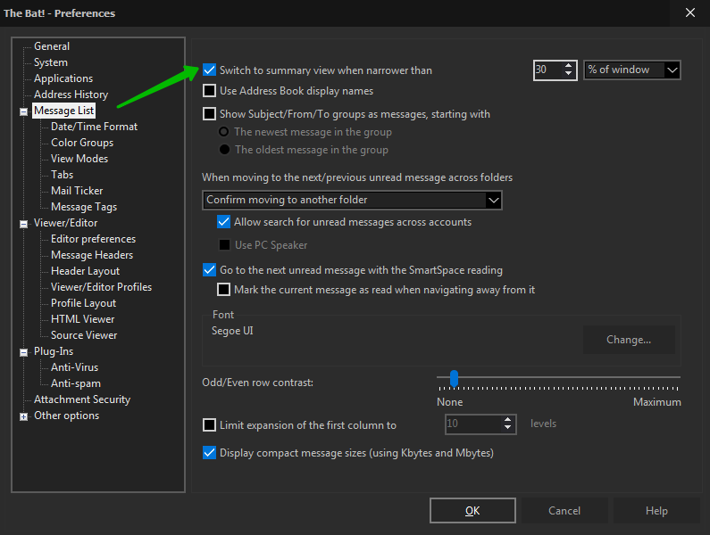
The default value is 30% of window. For example, if you choose this option and then enlarge the message list area dragging its border with the mouse, then The Bat! will change the view to the traditional one-line display.
Looking through the list of messages, you can quickly get an idea of what the content of particular messages are without opening them. The Bat! is smart to omit greetings, quotes and display only the relevant text.
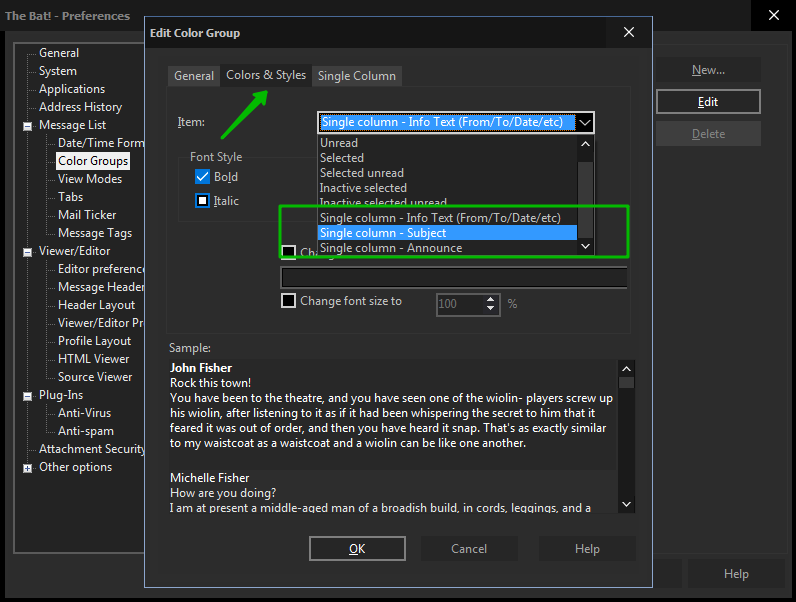
You can easily adjust the summary view: go to “Options -> Preferences -> Message List -> Color Groups”, choose “Generic Group” and press “Edit”. You can change the font, its style and size of the following elements on the “Colors and styles” tab:
- Headers (item “Single Column – Info Text (From/To/Date/etc)”)
- Subject (item “Single Column – Subject”). For example, you can use a bold font in a bigger size for the subject for a better overview
- Summary text (item “Single Column – Announce”)
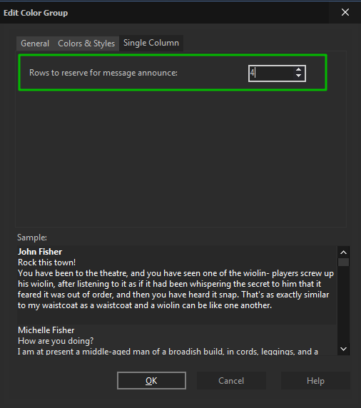
You can also change the number of lines in the summary and set it on the “Single Column” tab.
It is certainly possible to change the background color and the font color in the summary view as well, just edit the needed item in the same color group (like Normal, Unread, Selected unread, etc.). More about adjusting the themes you can find in our article: https://www.ritlabs.com/en/support/tips-and-tricks/7546/
Contacts with photos will be visually identified more quickly than the rest, while other senders will get distinctive initials.
What do you prefer – the summary view or the old-school display of the message list? You are welcome to share your thoughts!